Walmart accuses Kanye West’s new logo of being too similar to its own

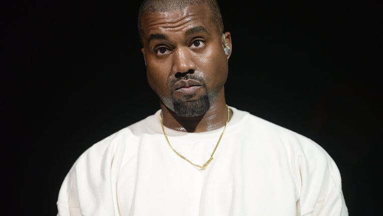
Kanye West(Photo by Scott Dudelson/FilmMagic)
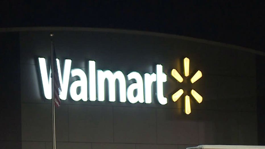
Walmart has complained that Kanye West’s new Yeezy LLC logo looks too much like its own spark logo.

The rapper’s company filed a trademark application for its new logo — which is made up of eight dotted lines arranged "as rays from a sun" — in January of last year, according to documents from the U.S. Patent and Trademark Office (USPTO).
Last week, Walmart filed a notice of opposition with the Trademark Trial and Appeal Board, saying Yeezy’s logo is too similar to its own trademarked logo.
The retailer’s logo — which is made up of six rays in a circle, "to resemble a spark" — was approved by the USPTO in 2008.
In its notice of opposition, Walmart accused Yeezy’s logo of being likely to cause "confusion" and make a "false suggestion of a connection" with the company.
West’s company Yeezy, did not immediately respond to FOX Business’ request for comment.
Walmart declined to comment to FOX Business. A spokesperson did, however, point to a letter it sent to Yeezy’s lawyers two days before the company filed the notice of opposition.
According to the letter provided to FOX Business, Walmart wrote to West's company in July 2020, August 2020, January 2021 and February 2021 and also had a telephone conference last month.
"Walmart has repeatedly sought to understand Yeezy's planned use of the Yeezy Application, with the goal of finding ways in which the Walmart Spark Design and the Yeezy Application can co-exist with one another," the letter said. "However, to date, we have not received any conclusive information from Yeezy regarding the planned use or any cooperation from Yeezy in order to find common ground."
The sun-shaped design isn’t the only logo West has been trying to get approved. Earlier this month, he applied for a logo with the letters YZY for his Gap collection, which was announced last year, according to the New York Post.
The newspaper reported that the logo is designed with white letters in a blue box, similar to Gap’s own logo.
That logo has also not been approved.
Read more at FOXBusiness.com.

